Introduction
Hi, my name is Chris Campbell and I have a color vision deficiency. Like roughly 7-10% of all males, my deuteranomaly makes it difficult to differentiate between some colors, like red and green. Color deficiency, or color blindness as it’s commonly referred to, doesn’t mean that I or people with similar conditions cannot see certain colors. They’re not invisible and I don’t see in black and white (a condition that is actually very, very rare). I can still use crayons effectively, find meaning in beautiful sunsets and even enjoy clear blue skies. What it does mean is that certain colors in the visual spectrum look a lot like one another and so I have a hard time sometimes telling the difference between certain colors and even shades.

Because of this, designing software and interfaces that will also work effectively for people like me takes a bit of concerted effort. Of all the elements of design (line, shape, size, texture, etc.), color is probably one of the most used elements to pass on informational states. This is probably because it allows a designer to say many things without having to change the form or layout of the design. While there are a number of simulators and plugins that can help you “visualize” what a color deficient person might be seeing, I honestly don’t recommend spending a lot of time with them. Instead, I’d like to propose just a few simple guidelines along with plenty of examples to help you effectively ensure that a good percentage of your audience won’t misinterpret your message.
Avoid Using Colors Alone as Visual Cues
Using color and color alone as a visual cue is appealing because it’s usually an aesthetically pleasing and a minimalist design technique. Calls to action and visual cues are critical to interface designers because users, especially on the web, have limited patience and are looking to process information and make decisions quickly. Since the brain recognizes and forms an emotional bond with colors almost immediately, colors are a natural choice for visual cues. Unfortunately, it’s easy to alienate or confuse some of your users when some of those aesthetically pleasing colors look very similar. To point out a few interfaces that use hard to differentiate colors as visual cues, here are a few examples that have given me some trouble.
Bad Cues


As you can see, all three of these interfaces use only red and green (two of the most misinterpreted colors) to convey states or provide information to the user.
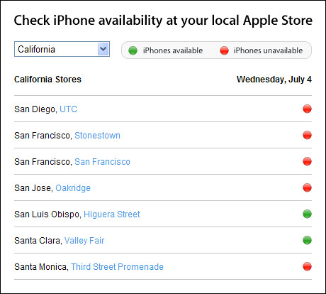
- Apple’s iPhone availability indicator uses color alone as a visual indicator. Interestingly enough, they state in their usability guidelines:
“Although color can greatly enhance a user interface, make sure it is not the only source of information. A color blind user may not be able to distinguish between two objects that differ only in color.”
Now, what they do provide is a legend of what red and green are supposed to look like for each state. But for me, it’s still barely possible to match their indicators to the live data, and so the example remains pretty frustrating. It is, however, slightly better than the other two examples.
- Warhammer Online, a video game, and MAMP, a development server application, exemplify the worst culprits because not only do they use similarly contrasting red and green colors as cues, but they don’t give you a reference or legend to help distinguish or label what “red” and “green” are even supposed to look like.
In order to avoid an angry mob of color deficient users, or to just ensure that you and your users are on the same page, here are some aesthetically pleasing interface examples that use text and icons, in addition colors, to communicate what’s going on.
Good Cues
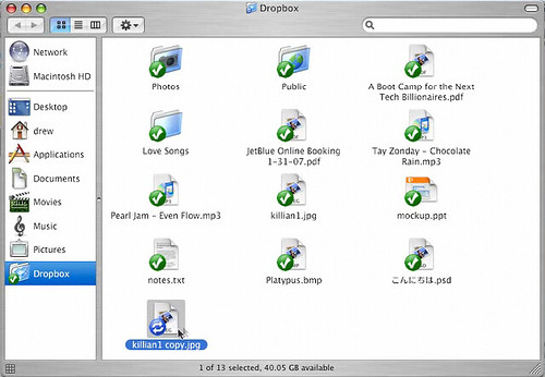

Dropbox users know the status of their files because of the colored circles and icons attached to each file. The colored circles can be confusing to a small percentage of viewers, but it’s pretty hard to misunderstand what’s going on unless you’re both colorblind and not familiar with their commonly used icons.
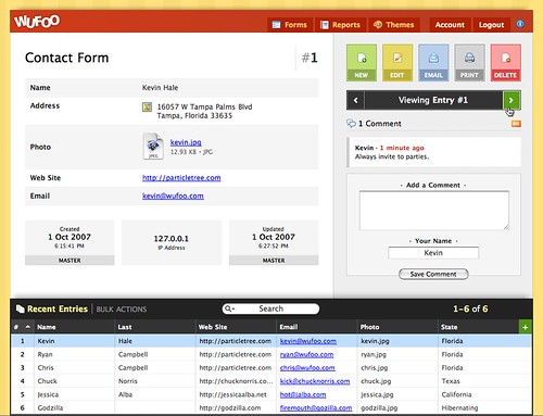
The Wufoo and Versions screenshots pretty much leave no room for misinterpretation because they, like a stop sign, use combinations of shape, color, and a word / icon to give their visual cues meaning and context. You’re sure to leave very little to interpretation when you use three visual cues to convey a single message.
More Good Cues
Again, Apple uses the hard to distinguish red, yellow, and green orbs as visual cues throughout their OSX windows, but this time they help those with color deficiencies by providing icons whenever you hover over the colored orbs. Since a user is only going to be interacting with those orbs when their mouse is hovering over them, it doesn’t hurt to hide the icons and keep the interface aesthetically pleasing until the user is clearly interacting with them.
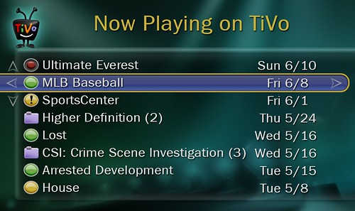
The TiVo interface is strapped for space, and in order to give multiple visual cues using color by itself, a recorded show is represented with a full, green orb, and a show that is currently being recorded is represented with a smaller, red orb. Even if somebody cannot differentiate the colors that Tivo is using in this situation, they can tell the difference between a small and large circle.
Use Contrasting Colors
Of course, as an interface designer, there are going to be times when you do not want to use icons or text as a cue due to space or aesthetic constraints. While I recommend using icons or text when you can, sometimes color and color alone is the most logical way or only choice to convey different information. Maps, for example, often use colors to display separate areas of information about a location. Also, sometimes designers want to indicate state by coloring just the text itself.
If you are going to use color alone, the best way to accommodate for the color deficient viewers out there is to get familiar with contrast. Kevin wrote an excellent article recently on programmatically finding good contrasting colors. Additionally, a couple of great resources about how to choose proper contrasting colors can be found over at lighthouse.org and 456bereastreet, but to give you a quick overview of what works and doesn’t work in my world, here are a couple examples.
Bad Contrast
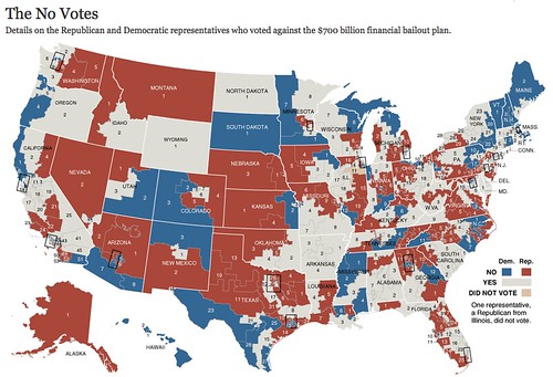

This New York Times map is frustrating because the “Yes” and “Did Not Vote” colors are extremely close in contrast, and they basically look like the same thing to me. I wouldn’t even recognize there are four colors being used on that map. And actually, the classic example for bad contrast for the color blind in Wikipedia is this NY Times Map.
Trulia’s maps are sometimes extremely tough to interpret for me because they not only use red, yellow and green, but they use multiple shades of those colors. I see this a lot of times in graphs and pie charts, and it’s probably the most frustrating example of all the screenshots I’ve documented in this article.
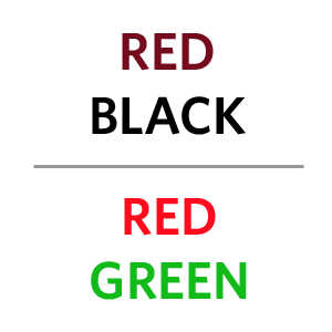
The red/black and red/green text are sometimes used as hyperlink colors on web sites. They can be problematic because certain combinations are colors that those with a deficiency often have trouble seeing.
Good Contrast
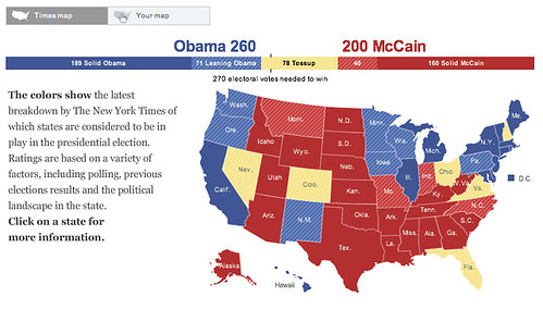
In this map, the New York Times does a better job because red and blue are easy to differentiate, and while light yellow and light blue can be confused by an extremely small percentage of people, the stripes they use clearly separate the states.
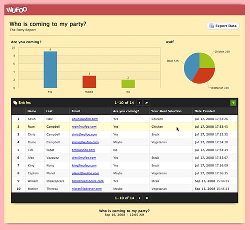
While this pie chart in Wufoo does use red and green, the colors in this example are contrasting enough to tell apart, especially when viewed directly next to another.
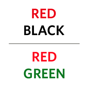
Here’s another set of text examples that are again a red/black and red/green combo, but they’re more distinguishable due to their higher contrast differences.
Conclusion
For the most part, this isn’t a call to arms. I’m not on a quest to change the world, fight discrimination or demand visual equal rights. As you can see, if you want to avoid making color blunders, all you really need to do is to take a minute to make sure you provide a legend, use icons or words when possible and make sure your visual cues are high contrasting. You probably do not need to run your designs through a color checker and stress over whether or not your interface is going to offend your viewers. In fact, there’s a pretty good chance you’re working near or know somebody with a color deficiency, so having them give your design a once over is a great way to ensure your message is seen properly.
Additional Reading
Blindness - A series of images that are shown in both normal vision and how they appear to someone with a red/green colorblindness.
What about Traffic Lights? - Daniel Flück writes about why traffic lights do not confuse him. Wikipedia also notes, “Usually, the red light contains some orange in its hue, and the green light contains some blue, to provide some support for people with red-green color blindness.” This explains why color blind people do not actually need to memorize the location of where green and red lights are located, especially in the dark when you cannot pinpoint the location of where a light is coming from.
Emerson Moser - In 1990, Moser was Crayola’s most senior crayon moulder and retired after 37 years. After moulding approximately 1.4 billion crayons, he revealed that he is actually color blind.
Camouflage Detecter - There is an upside to being color blind and it’s that you have the super human ability to detect camouflage like U.S. soldiers did in World War II. That might also help explain why most animals have some form of color blindness.
Colorblind gaming or: Table Tennis is impossibly hard! - A color blind video gamer explains why Rockstar’s Table Tennis may be the most difficult game ever.
Seeing Through the Eyes of The Color Blind Shopper - “Many consumers throughout the United States have impaired or limited information processing capabilities as part of congenital or illness-related disabilities, yet their specific problems and needs are often not formally considered by firms, by researchers, or by students preparing to enter the business world. I learned this quite by accident in my own Consumer Analysis class when I gave a routine assignment to my students.”


As a colorblind (partial, red-green, orange-brown, blue-purple) user, and industrial designer these same issues drive me crazy.
Here are some simple tests for graphic fluency when you make a design to know if color blind people can see the image.
First, strip the color to gray scale. If you are losing information, so are your viewers.
Graphic designers tend to be VERY color concious, which also means color choosy, and specific. In this case, tiny shades can have a lot of meaning. However, in this, even mild color blind users can easily misinterpret their meaning. Go take something people have “mis-read” due to color-blindness, or any old project and strip out the color (gray scale). If there are blocks of missing data, or things are more difficult to read (get out your “bad eyes reading glasses” to test this and by that„ I mean„ don’t look at it with 20-20 vision, just because you can see the resolution perfectly, doesn’t mean everyone else can (think grandpa/grandma is looking at it).)
If any information is lost, you’re in trouble and need to make a change.
Another quirk I see often is the red-green gaming conundrum where designers will make opposing teams red and green„ STOP THAT PLEASE. These are the most confused colors. The simple addition of textures and shapes can do worlds of wonder, but again, if you MUST use red and green, or other colors of this nature, be sure to go gray scale and test that you can see it.
Great article Chris, Thanks!
This is a very thorough write-up with a number of good examples. In my first applications job at an EDA company one of the founders was colorblind. All of the applications that they developed for chip design had user controlled color palettes so that a user could adjust settings to generate maximum contrast (the default at that time was green for polysilicon and red for first layer metal which had caused headaches for a lot of chip design engineers).
If you are doing focus groups for website reviews there are screening tools available from http://colorvision.typepad.com/color_vision_store/ that help determine if any of your testers are colorblind and the nature of their particular impairment. We interviewed the founder, John Nash, at http://www.skmurphy.com/blog/2008/02/20/founder-story-john-nash-ceo-color-vision-store/ who like you was colorblind and started the website with his brother to gather together resources for color blind folks.
It’s worth noting that all the complaints about the iPhone availability finder’s colorblind-unfriendliness was heard by someone. The iPhone 3G availability page used shapes in addition to colors: http://techblog.dallasnews.com/iphone%20availability.jpg
Yes, I remember playing Quake at a LAN party and had to ask that the team colors be more distinct. I have red/green colorblindness. Sometimes I’d end up chasing my own team members and shooting at them. Ugh.
When people ask me about color blindness, I tell them I can’t tell the difference between the different colors in the board game Trivial Pursuit. Is it Green, Red, Orange? I dunno.
Good article.
I am a colorblind marine/underwater artist who has learned to appreciate my ‘disability’ since I am slightly red-green colorblind. However, since the first color to leave the spectrum while underwater is red, what I see while scuba diving is what you see. I do have some paintings that really ‘wow’ the non-colorblind with my overuse of red and orange but I fear they are too abstract. Don’t get me wrong, I can see some red and green, but not as clearly as someone who has all those silly rods and cones in order.
Great article and examples. FYI the URL to Dropbox is getdropbox.com
Colourblind-safe colours for mapping have been developed by Cynthia Brewer, as I documented in my book (available online, but I don’t feel like looking up the URL).
Joe, the link for Cynthia’s ColorBrewer is: http://ColorBrewer.org/
Nice work! Thank you.
Yes, I have color deficient vision. Yes, a lot of websites I visit are a torment to deal with because of poor color choices.
I also fly airplanes. To get a pilots license (USA) one must pass a medical exam, including a color vision test. I flunk the test (colored spots in an image where a pattern in the spots show a letter or number) every time. The FAA accounts for color deficiency by letting those who flunk the standard color vision test by taking a different exam administered directly by the FAA. The exam allows you to demonstrate your ability to distinguish between “aviation red” and “aviation green”. The FAA has chosen specific shades of red and green that are used in various signaling mechanisms (tower signals, navigation lights, etc) that are distinguishable by most color deficient people. The red looks, well unlike the others. The green looks blue. The white, isn’t blue, isn’t the red thing. It works for me.
I’m colorblind and write software tools. My recommendation to GUI developers is to print GUI screens to a black and white printer and if you can’t understand them, then colorblind people won’t either.
~Matt
What a great article, Chris thank you so much.
I’d like to use the opportunity to ask something simple. Please don’t get me wrong, I understand and wholeheartedly agree UIs should be usable by everyone but, with a progressive enhancement goal of sorts in mind, how would you feel about a high contrast option in a web-app UI, such as Windows or Mac OS offer? Would that feel as discrimination?
What I mean is: in order to appeal the most to both users blessed with all the rods and cones and ones with special visual needs, the designer could, perhaps, for example, add an option which enhances contrasts and/or adds new layers of differentiation to an interface. Something like a link to a screen-reader version, which quite a few websites and applications sport today.
I certainly believe the least common denominator must be great usability for everyone, but if there’s an option to make the UI better for everyone using additional options, would that be a bad idea, in your opinion?
On the other hand, I also think a great designer should embrace this kind of additional challenge, in order to achieve even better results. So this is more of a general wondering actually.
Great article and very useful for us webby types although I find the worst culprits are hardware manufacturers. The amount of times I have turned somthing off instead of on because I thought the LED was red and not green is quite annoying.
Bruno, I think that might be a little bit of overkill. It would probably take a designer more time to create multiple versions of a site or application than to just make sure there is nothing that might cause issues for color blind visitors. Like some of the commenters stated, just give it a once over in a desaturated state and you’ll be able to see if there is enough contrast.
I think the bigger challenge and better alternative for a designer is to create one design that can be easily viewed by everybody. It’s not color in itself that causes trouble, even if it’s a red/green combo, but only when you use those colors as visual cues. So just follow the basic guidelines when you’re designing visual cues and you won’t have to worry about completely separate designs for a subset of your viewers. I highly doubt that using only red/green combos, or other difficult to differentiate colors, are critical to the overall design of any site.
I just installed the new Adobe CS4 at work and was completely blown away when I found, as one of the proofing options, “Color blindness”. I tried it out with some intensely colored photos and color swatches and was absolutely amazed at what I saw. I’ve been trying, for years, to understand color blindness - to try and imagine what color blind people see - and here it was (in what I would call yellow, brown and blue).
Great big amazing - super-stupendous kudos to the people of Adobe for bringing me this opportunity. I and my design work will forever be impacted with this knowledge!
good work. thanx